

Thorn Soundlabs
FlexMade worked together with Thorn Soundlabs to refine and enhance their Shopify storefront, with a strong focus on improving mobile usability, product clarity, and overall shopping experience. The goal was to make the buying journey more intuitive, visually balanced, and better optimized for conversion across devices.
About client
Thorn Soundlabs is an online brand specializing in audio products sold through a direct e-commerce channel. To better serve mobile and desktop customers, the company needed a more structured storefront that clearly communicates product value and supports a smoother path to purchase. Their focus was on creating a modern, responsive store where product presentation, navigation, and checkout flow feel consistent, clear, and easy to use.

About project
The project was centered around improving the existing Shopify setup by addressing usability issues and strengthening the overall structure of key e-commerce pages. Special attention was given to mobile experience, where layout density, visual hierarchy, and content organization were affecting user engagement.
We focused on improving how products are displayed, how users interact with key buying elements, and how information is structured across product and checkout flows. Alongside this, we worked on enhancing media presentation, simplifying content readability, and making the entire shopping experience more cohesive.
Objectives & Challenges
Thorn Soundlabs needed a more effective mobile-first shopping experience with clearer product communication and improved conversion paths. The existing design suffered from weak visual prioritization, where important elements like pricing and purchase actions were not immediately noticeable.
Product pages contained dense, unstructured content, which made it harder for users to quickly scan specifications or understand product benefits. Excessive vertical scrolling on mobile also reduced engagement and created friction in the browsing flow.
In addition, cart and checkout interfaces required improvements in spacing, readability, and accessibility, particularly on smaller screens. The project also aimed to strengthen storytelling through better use of visuals, structured content blocks, and trust-building elements such as testimonials.
Approach & Methodology
The work was delivered through an iterative and feedback-driven process, with a project manager coordinating communication between the client and development team. Tasks were initially defined in a structured backlog, but new requirements were also introduced throughout the project as priorities evolved.
Each update went through review cycles with the client before final implementation, ensuring alignment with expectations. The team focused on continuous refinement, usability validation, and maintaining consistency across mobile and desktop experiences.
Storefront & Collection Experience
We improved the layout of collection pages to make product browsing more focused and visually clear. Product cards were adjusted to increase visibility, while non-essential visual elements were reduced or repositioned to avoid distraction.


Product Page Structure
Product pages were restructured to highlight essential information at the top, including product name, price, and purchase button. The layout was simplified to improve clarity and reduce cognitive load during decision-making.
Product Content Organization
Long product descriptions were replaced with more structured formats, including short summaries and clearly separated specification blocks. This made the content easier to scan and improved overall readability.


Visual Content & Media Enhancements
We enhanced product storytelling through improved media sections, including richer image layouts, autoplay video integration, and dedicated feature highlight areas that better communicate product value.
Trust & Social Proof Elements
Testimonial sections were introduced to reinforce credibility and provide additional reassurance during the buying process.


Cart & Checkout Improvements
The cart and checkout interfaces were refined with better spacing, improved contrast, and simplified layout structure to ensure smoother navigation on mobile devices.
Responsive Optimization
We refined responsive behavior across breakpoints to ensure consistent usability across devices. Layout behavior, spacing rules, and interactive elements were adjusted for a more stable and predictable user experience.


Job done
The Solution
FlexMade delivered a redesigned Shopify experience that focuses on clarity, usability, and stronger product presentation. The improvements resulted in a cleaner interface, better structured product pages, and a significantly more intuitive mobile shopping flow.
The Result
The updated storefront provides a more comfortable and efficient shopping experience, especially on mobile devices. Users can now navigate products more easily, understand key information faster, and complete purchases with fewer friction points. The improved structure and visual hierarchy also contribute to better engagement and a more consistent brand presentation.
The technologies
-
JavaScript

-
PayPal

-
Shopify

-
Cloudflare


Related cases

Fobe
A Berlin-based fashion-tech startup that runs a subscription and rental platform for luxury designer handbags.The company offers memberships where customers can rent high-end handbags for a monthly fee, with options to swap bags regularly or keep a favorite longer.
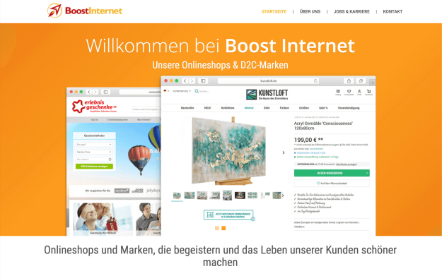
Boost Internet - Kunstloft
Boost Internet GmbH is a digital agency that provides comprehensive online solutions for businesses. They specialize in e-commerce development, web design, and online marketing. Boost Internet owns and manages the KUNSTLOFT online platform, an online retailer of art and home furnishings based in Munich, Germany. KUNSTLOFT offers a curated selection of artwork and décor, working directly with international artists to provide unique pieces at accessible prices.
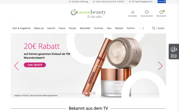
Asambeauty - M. Asam Cosmetics & Skin Care
FlexMade helped Asambeauty enhance customer engagement with an intuitive mobile app and a website, offering seamless shopping, personalized features, and secure payments.
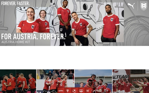
Online Fan Shop for Austrian Football Association
The Austrian Football Association (ÖFB) is the governing body of football in Austria. Founded in 1904, the ÖFB oversees national leagues, cup competitions, and international matches. Committed to promoting football at all levels, the ÖFB inspires and unites the nation through the power of the sport.
Contact us
- Phone Number: +1 (425) 247-0867
- Email Address: [email protected]